

Inking Tutorial: Brush & Ink
Greetings! I've recently unearthed this tutorial from 2011. For some reason I deleted it, and up until now I thought it was lost to time... but with some data scouring I've managed to locate all the original text, images and videos and have pieced it all back together.
Enjoy, and happy inking!


Hello! My name's Anton and I draw for magazines such as GQ, MAD and Billboard, plus books and other commercial and advertising projects. Looking around the site you'll see a lot of clean line art, but for this tutorial I'm going to draw one of the things I love to do with a brush: a loose, goofy, cartoony, illustration - and hopefully I will be able to share some insights into the art of inking along the way.
Inking is fun! There's something intoxicating and slightly scary about laying down permanent ink over a sketch you may have spent hours on. When I was starting out I often felt that I lost the energy of the sketch after I had finished. These days it is the opposite - I am confident I can inject even more energy into a drawing by just remembering a few tips and doing a little practice. But more on that later. First, we take a look at what we need to get started...
Inking Tools

Disclaimer: I change my tools and workflow from time to time. Plus, let it be known that I am completely self-taught. The only book I've read is 'How To Draw Comics The Marvel Way' at the age of 15, and over the years I've experimented, studied my favourite cartoonists, and slowly developed (developing, still) a style and flow that works for me.
Take what you like on board, and do what suits you best.
Ahem... So, onto the tools. The beauty of this style is that you don't need much. At the heart of it there is just paper, brush and ink. But there are a few more items that are handy in a studio setup:
Drawing Board - Drawing on an angled surface is very important. Drawing on a flat table is not only bad for your back, but affects the way you view your art - elongation and distortion can occur without you realising it. An angled surface allows you to view the art with a better perspective. I used to have my board at a much higher angle, but over the years of drawing in sketchbooks on my lap, I've brought it down to match. Some people use a lap board against a desk, which is a great, portable option, too.
Lamp - Get yourself a 'daylight' globe - it's easier on the eyes and casts a more natural light which is necessary if you are using colour.
Winsor & Newton Series 7 Brush - Pure Sable - These are nice brushes. They hold a lot of ink, and offer a large variance of line. I'm using size #2 here. W&N sizes tend to run large, so it is more like a #3 in other brands. These are a little more pricey than some, but if you take good care of them they can last for years.
Roymac 'Golden Sable' Brush - Synthetic fibre - I learned to ink with these cheaper brushes, and used them professionally for years. In fact, I used to use them exclusively up until I fell in love with the real sable ones. They are easier to control, but have less line variation and hold less ink. I use them now mostly for whites and touchups. The one pictured is size #1
Dip Pen - I use a Gillott 303 or 404 nib, or pretty much anything I can get my hands on. Most of the time (like with the illustration I've drawn here, below) I ended up doing it all with the brush, but if I need to do more hatching, or need less varied linework (say, for background objects), I'll use the pen a little more.
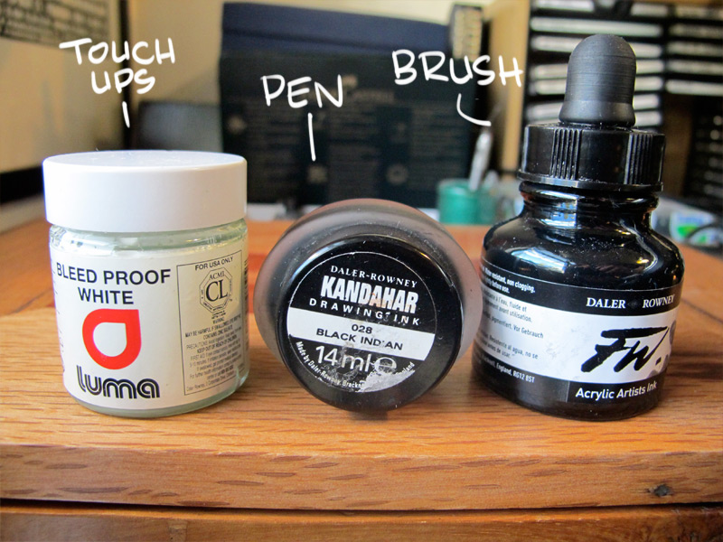
Ink - (see photo, below) - Most india ink works just fine. These days I'm using F&W but there are plenty of other good brands. One to avoid is the Winsor & Newton (the one with the spider character on it) - it has a drying agent added which takes its toll on your brushes, and dries out the bottle more quickly.
White Gouache - (see photo, below) - For painting on black, touchups and mistakes. You'll seldom find an inked piece without a bit of whiteout, so don't be afraid to use it. I'm yet to find a brand that is wet enough yet truly opaque.
Paper - I've used the Winsor & Newton Smooth Surface Heavy Weight 220gsm here. It has a nice, natural colour and is fairly smooth, but not slick. It still feels like paper. For ink wash you'll need a heavier watercolour paper - I like the Arches 300gsm smooth.
Eraser - Choose one that's not too harsh, and won't take the ink off the page. I think this one's just a Staedtler, nothing fancy. Always rub out softly, and wait until your ink is completely dry!
Getting Ready
Setting Up
Get everything ready and in place. I'm a southpaw, so I have my ink and water on the left. You can dip straight into the ink bottle, but I use a small ceramic ink pot that sits in a block of drilled out wood. This way I can fill it with just enough ink so I don't overdip the brush (more on that later).
I also have a piece of paper to dab excess ink away before I hit the paper. If you prefer you can tape this paper to the drawing board. Plus a piece of paper towel or tissue on hand in case of accident, or to blot excess ink.
You'll also notice a nice large jar of water. This is for cleaning the brush every now and then. The larger the jar, the less I have to change the water.
Warming Up
You'll want to loosen up and draw some fast lines, doodles, swirls and anything else that takes your fancy. The longer you do this, the better. I usually do a few minutes, but if I'm going in cold from not drawing at all that day, I'll spend at least 5 - 10 minutes.
Please view the video above for an explanation and demonstration of a few inking techniques. Below is the scanned page that I warmed up with, so you can see the marks I'm making a little better.
Basics
Here are a few tips I wished I had have been told when I was starting out! While I've only used a brush in the demonstration drawing, I've included some tips for the traditional dip pen, too.
Dipping Your Brush
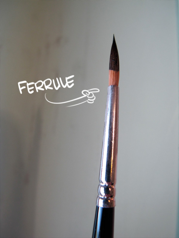
Don't dip your brush past the ferrule (the point where the bristles are glued). If ink is allowed to penetrate and dry, it causes the bristles to splay. I've ruined many a brush like this. If you do over-dip, just give it a good shake in clean water.
After you've dipped the brush, touch it to the side of the ink bottle/receptacle, and then give it a couple of dabs on the paper to remove excess ink.
If your brush is wet with water, dry it a little on the paper towel, then dip, dab, then dip again - otherwise you can get a washed out line.
Dipping Your Pen


You only need to dip your pen nib to just past the breather hole, and no further than the dotted lines in the photo above. If you dip it past this, the ink creeps up the handle and can cause a nice mess.
Holding Your Brush
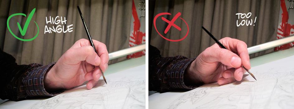
Keep your brush angle high. This is quite important. The higher the angle you hold your brush, the more you can do with it. Your curves will be more even, and you'll be more in control of the brush and the types of strokes you are able to make.
Holding Your Pen
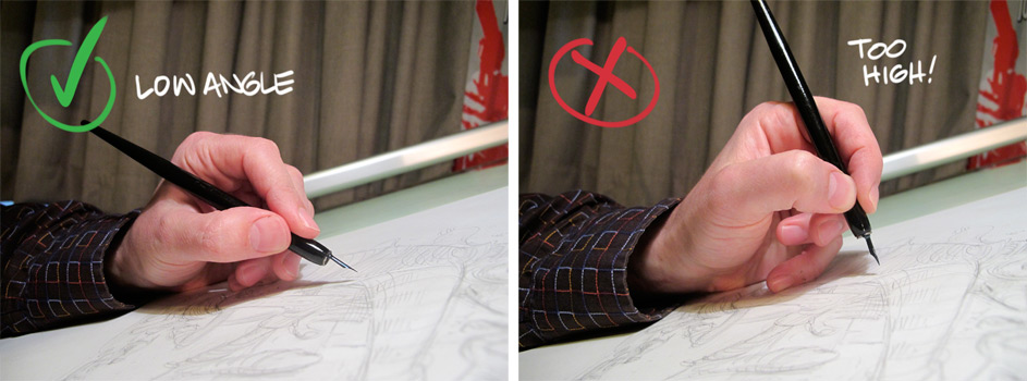
The pen is the opposite - you'll need to keep a nice low angle to avoid the sharp nib catching on the page. Holding it this way also gives you a more varied line, as the tines (the two separate parts of the point) can separate more easily, and with less pressure.
You'll want to draw mostly in the 'downward' direction, but if you use light pressure and have smooth paper you can make upward/diagonal strokes too.
Brush Strokes
The brush is a very versatile tool, and is capable of making many types of lines and marks. Below are a few I've drawn up quickly to illustrate this, but there are many more, including dry brush, spatter, and other types of hatching.
Have fun experimenting, but remember not to push your brush too hard. Like any tool, you'll get the best result by using it within its limitations, plus you can ruin the bristles if you are too heavy handed with it.

Getting Into The Zone
Ok, this sounds 'new age' and a bit stupid, but sit in front of your pencils for a minute, and think about what you're about to draw - which lines will need to be heavier, which lighter. Make sure you're relaxed and comfortable, and warmed up.
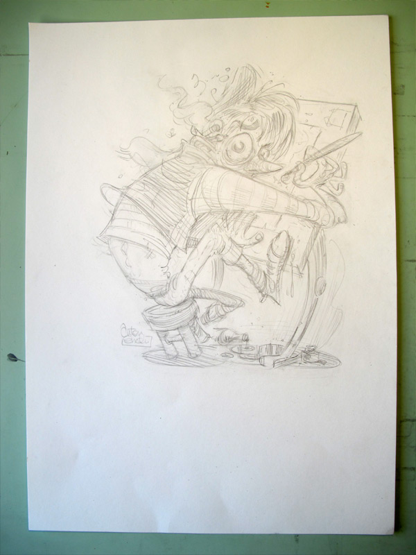
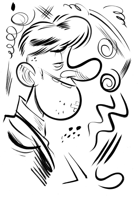
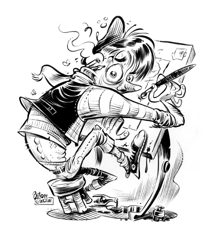
Here's the sketch - ready to go. For a commercial job I'd tidy it up a lot more, but this is enough detail for me to ink it. I've drawn it on A3 sized paper. I like to draw as large as I can, wherever possible.
Start Drawing!
And in the heading is the key to inking, right there. Drawing. You're not a 'tracer', like Chasing Amy would suggest! For years I would just trace the lines perfectly and then wonder why the drawing looked flat. You need to really draw the lines like you're doing them for the first time. This doesn't mean you have to go super-fast all the time, though - some lines need a bit of care.
Speed
The speed at which you ink will affect your art. Slow, deliberate lines will convey a different feeling than blisteringly fast ones. There are plenty of great artists that draw slowly, but I tend to do most of my linework with a medium pace, cracking out the fast strokes where applicable - usually on the major lines, hair etc. Straight lines should always be drawn fairly fast if you want to avoid wavering.
Put Your Shoulder Into It
While smaller lines will require a little bit of wrist and finger finesse, big, confident lines are best achieved using your elbow and shoulder to do the work, keeping your wrist fairly stiff. After chatting with a lot of pro inkers, the same advice keeps popping up - draw these bigger lines away from your body. It affords you more freedom of movement.
Rotate Your Page
I used to tape my page to my board. For years I struggled with some linework, until I realised that I could lower the angle of my drawing board and just have the page loose. I keep it from moving with my other hand, and rotate the paper to make drawing the lines more comfortable.
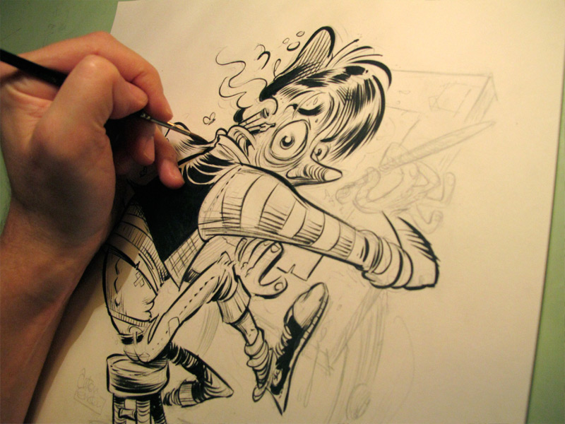
Inky Pinky
As I mentioned in the warmup video, I use my pinky finger to act steady my hand, and to control how close the brush gets to the paper. Sometimes I will lift my whole hand off the page to do a big line, but you have less control this way. If you have a look at the image below, you will see an example of how I position my hand.
Varied Lines
For me, line variance and expression is key. The brush is perfect for this, and is capable of delivering hairline thin to broad, thick lines in one stroke. To achieve this you need to apply light and heavy pressure, depending on the line you require. This can take some time to master. It took me a good few years before I felt like I was in control of the brush - and this old dog is still learning new tricks.
Practice
You know how I said you needed a little practice earlier? Well, I lied. You need a lot of practice. Every successful artist has put in countless hours to master their craft. You need to draw a lot, and regularly. I ink in my sketchbook every night just to keep my hand in form if I've been drawing digitally. It's almost like being an athlete (but without all that pesky exercise and diet) - you need to keep in shape.
For sketching I usually just use a Japanese brush pen, as there's no cleanup. A great, cheap one I've found is the Pentel Standard Brush Pen (not to be confused with the Pocket Brush Pen). It's a great brush substitute, and the only brush pen I would consider inking professionally with.
Paint it Black
Black is your friend. A lot of cartoonists these days seem to be shying away from it, perhaps due to fashion. It's a shame, as solid black wields a lot of power. It adds weight to a form, and draws the eye.
I like to fill in the blacks (spot blacks) as I go. I always used to leave them till last, but now I find that if I do it as I ink I can adjust the other line weights accordingly.
Fixing Mistakes
It's ok to draw a dud line or two. Who cares? We all do it. If it's ruining the drawing, just dab a bit of white paint and have another go. If it's a very large area, you may want to glue a piece of paper over the entire area and redraw that. Or you could just go at it in Photoshop later, which is much easier!
Remember that not everyone that views your drawing will be hunched over and scrutinising it like you are. At print size, and at a normal viewing distance, most 'errors' are not even noticeable.
And so, we're pretty much there. You can scroll down to see the finished art. But before that we need to do make sure that our brush is in good shape for next time. Yes, I mean...
Cleaning Up
Unless you're made of money (and what cartoonist isn't?) you'll want your tools to last a long time. Cleaning up thoroughly will save you cash in materials, plus the trips to the store when you realise your favourite brush is splayed.
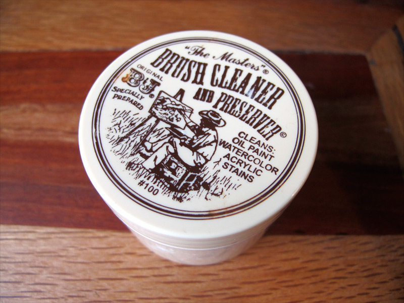
Rinse your nibs and brushes in warm water. Swirl your brush around in the brush cleaner (above) and massage the bristles with your fingers gently under running water until they are clean. Then dry it off, gently, and coat the bristles with a little of the cleaner, shape it into a nice point, and it'll be ready for next time.
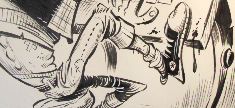
Finished Art
And so, we have the scanned finished inks...
Thanks for reading, and please feel free to browse the rest of my blog.
More resources: If you haven't already seen it, please visit Tom Richmond's excellent Inking Tutorial. It's a must for all cartoonists. It covers some of the same ground, plus more, with the difference being that Tom is very eloquent in explaining the craft, and a deft hand with a brush and pen (which I have neglected here, largely).
Comic Tools also has some great tutorials on inking and traditional materials by the talented Matt Bernier.
Anton Emdin is a Sydney-based, award-winning illustrator and cartoonist working in publishing and commercial art.